Finding just the right fonts to encapsulate your brand and personality can be a challenge. Check out tips from experts and some great resources for font pairings.
Techie Mamma
One of the first things to think about is if you have any special fonts that you have already attached to for your brand? Maybe you have some fonts in your logo or on your business card. This can be a great please to start.
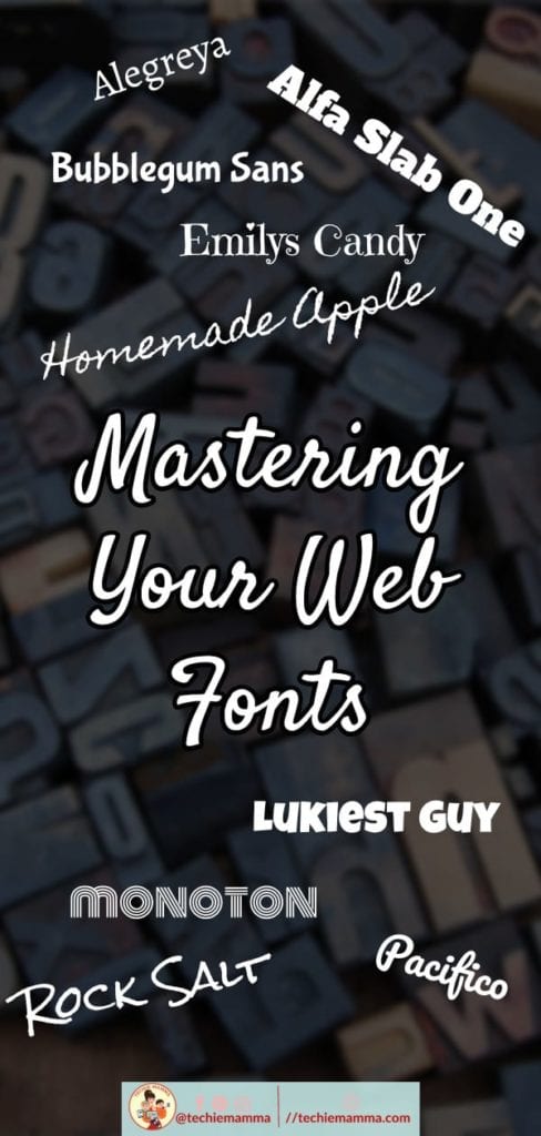
My favorite fonts are from Google Fonts. They have a huge selection, are free and the license is open and they are already pre-installed with many themes. You can see the whole collection of Google Fonts here https://fonts.google.com/. Updated for 2020, check out the 100 best Google fonts to use this year.
Along with your colors, your font selections will define your brand and you should stick to your fonts in all of your artwork to maintain your brand throughout all your assets.
Font Combinations Recommended
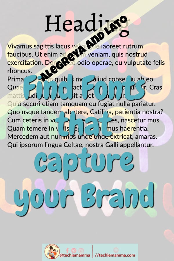
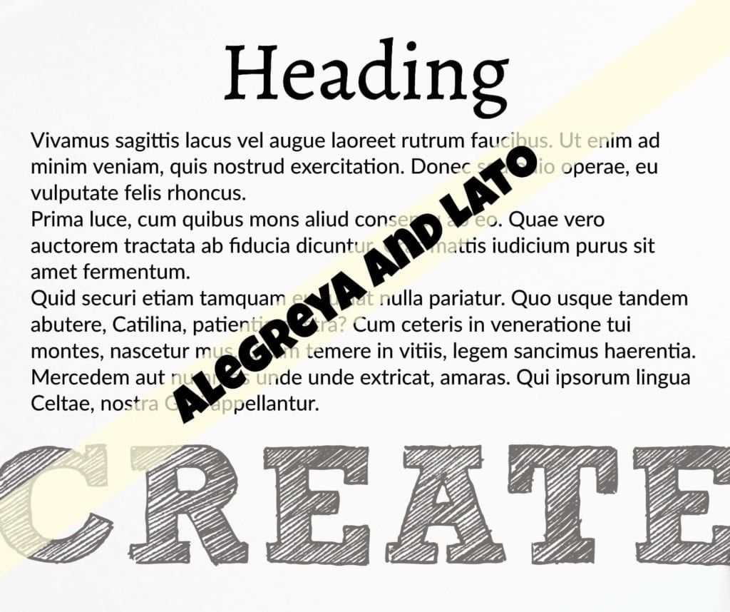
One of my favorite font combinations is Alegreya and Lato. They are both Google Fonts and they are each unique but together are quite the rockstar combination together. Alegreya is a great font that has a natural and friendly feel. Not too bold, not too cursive but just right for headings. Lato is one of the best all-purpose Google Fonts. It works great for headings and body text alike. They are both easy to read and understand which is so important for web pages and traffic. There is still a fun element but without sacrificing a practical approach.
Need more ideas to check out? Try creativebloq free web fonts, awwwards best web fonts, and inkbotdesign combinations.
The website https://fontpair.co/ has a great feature where you can test out with your own text the font pairs that they recommend. Just put your cursor in the box and replace the text.
The Experts Talk About Fonts
“Try to limit the number of fonts used on your website so that it is clean and easy to read. Use font families (bold, italic) to differentiate information or make something stand out.”
Heather Tonne
Graphic Designer
www.heathertonne.com
Don’t be afraid to go bigger! When it comes to reading on computer screens and especially on mobile you don’t want your users squinting and straining to get your content.
https://www.rigelceleste.com
I’m all about Google Fonts! 🙂
http://mamaneedscoffee.online
“Finding the right font is like finding the secret ingredient and incorporating it into a favorite recipe. Not too much, not too little. When you find the perfect font(s), (sometimes after lots of trial and error) you’ll know, because the final product will leave you thinking “wow, that hit the spot!”
Nancy Santillan, Firefly Graphic Design


 BY TECHIE MAMMA